One of my anxieties of living in the San Francisco Bay Area over the past 10 years has revolved around “The Big One”: the next great earthquake born out of the San Andreas’ fault, one equivalent or greater than the 1906 event which left most of the city in ashes. However I have taken for granted a more common place type of disaster: fires.
Towards a new abnormal
During the fall of 2017, fires came to affect me in two ways: the first being that of a close one having to relocate due to a (thankfully mild) structure fire, and the other stemming from the series of wildfires in the North Bay also known as the 2017 Sonoma Fires. The former showed how disruptive such an event can be for any individual, including the difficulties of disaster response agencies to accomodate victims of fires, even in a major city. The latter, which I experienced through the sight, smell and taste of degraded air, was a rude awakening to the environmental impact of large-scale fires.
I was intending to write this post a couple of months back, with the intent to compare air quality readings in the SF Bay Area between this year and last Fall. All I intended to show was a comparison between baseline conditions (i.e. air quality with the absence of major nearby fires) and 2017 data which I had already collected a few months back in my data bootcamp. However as I was working through it all, this happened (taken on November 9th at 1pm):
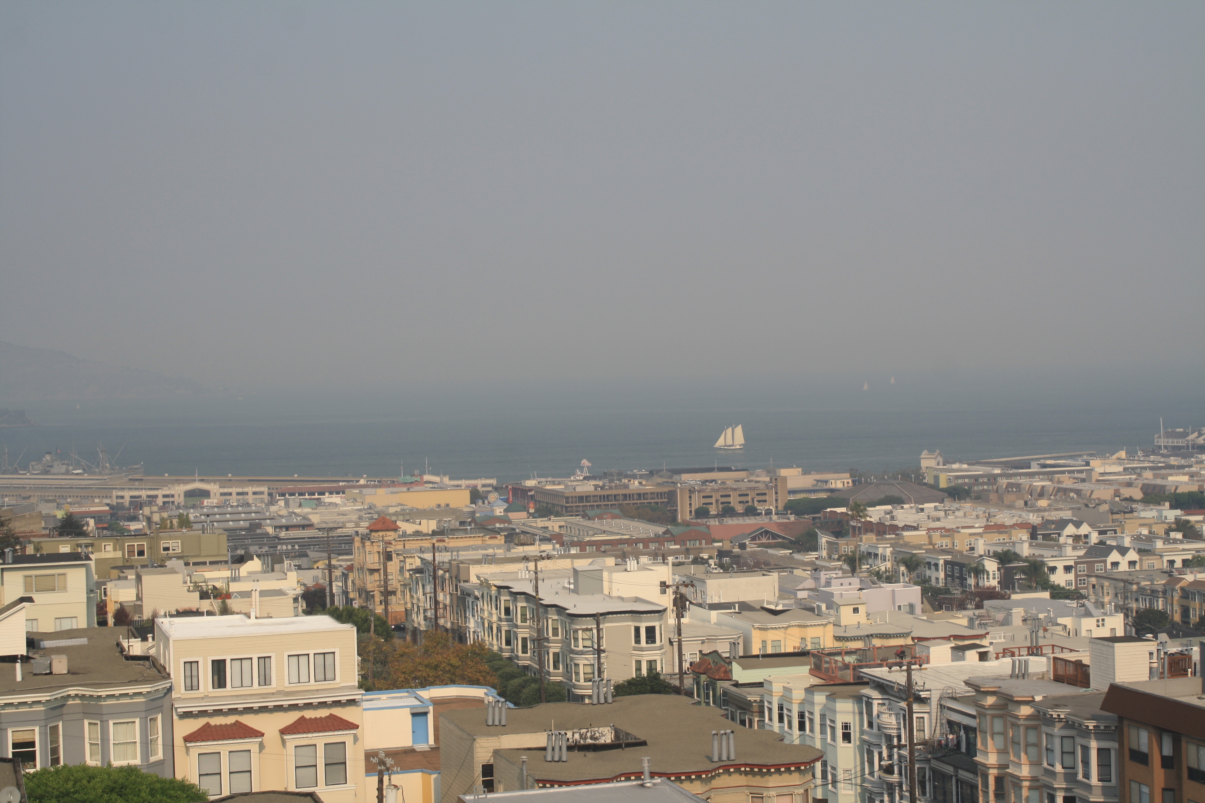 The view from San Francisco of Alameda and Marin Counties remained covered by the downstream Camp Fire's smoke for the better part of two weeks, an impact far lasting and felt than the 2017 Sonoma Fires.
 conditions, Alameda and Marin Counties are visible from San Francisco's North Point") By comparison, under normative (and clear weather) conditions, Alameda and Marin Counties are visible from San Francisco's North Point.
By comparison, under normative (and clear weather) conditions, Alameda and Marin Counties are visible from San Francisco's North Point.
This lead me to revisit the U.S. Environmental Protection Agency AirNow’s API to comprehend the scope of the Camp Fire’s effect on air pollution in the Bay Area compared to last year’s the Sonoma Fires.
From Bad to Worse
First, a bit of background info on the data:
● The data provided is classified into a categorical unit known as the “Air Quality Index”, or AQI (see chart below);
● The measuring sensors are tuned to measure levels of Ozone and fine particles respectively in the air;
● The AQI is an average of measurements over regular hourly intervals over the course of a day (more info);
Specifically we are interested with fine particulates, namely PM2.5Particles. These are coarse dust particles of about 2.5 micrometers in diameter–about 3 times thinner than a single human hair–and are borned out of combustion. As you may have guessed, there is a strong correlation between fires and a large release of PM2.5Particles in the air, which represent a significant environmental health hazard, especially for populations vulnerable to respiratory diseases. I can personally attest to the particle’s foul burning odor, and the enduring parching effect it can have on one’s throat if exposed to unhealthy levels even for just a few minutes. Exposure to any amount of these particles should be minimal in all circumstances.
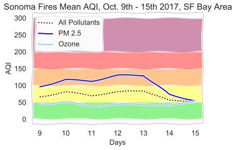
For the period of the Sonoma Fires, which were part of a larger chain of events otherwise known as the Northern California Fires, I retained data spanning from October 9th to the 15th 2017. The reason being was to 1) limit the scope of my analysis to fires with a most direct impact on air quality impact in the San Francisco Bay Area and 2) to work around resource limitations, namely the API’s limit on requests and time allocated for the project. What I refer to as the “2017 Sonoma Fires” is in fact comprised of 3 fires spanning Sonoma and Napa County: the Atlas Peak Fire, the Tubbs Fire, and the Nuns Fire.
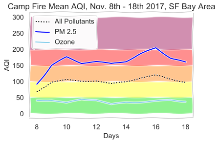
The Camp Fire’s AQI was sampled from November 8th to the 18th of this year, the end date at which over half of the fire was contained (and air quality in San Francisco noticeably began to improve).
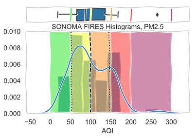
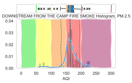
The charts above illustrate descriptive statistics of the AQI for the Sonoma and Camp Fires respectively. What can be gaged from simply observing the distribution of AQI between the two events is the magnitude of the catastrophe that was the Camp Fire. While the [1] histogram of the Sonoma Fires isn’t exactly normally distributed as the data peaks slighly in the Unhealthy range, its average (as indicated with the bold dashed line) sits at the cusp between concentration levels of Moderate and Unhealthy for Sensitive Groups. [2] By contrast, despite being much further away than the fires over the North Bay (about 140 miles/ 230 Km away from San Francisco!), the average line shown on the histogram of the Camp Fire falls square in the Unhealthy range. Not only that, but its distribution is much more compact, forming a narrower bell curve, whose standard deviation falls still within the Unhealthy range. The point being: the AQI measurements of the Camp Fire were less spread than those of the Sonoma Fires, indicating a greater trend of degraded air quality in the Bay Area despite the much greater distance of the source of impact!
The timeseries showing the change in AQI for both ozone and fine particulates often parallels progress with containement and possibly changing weather conditions. [3] The cut-off date of October 15th is arbitrary, but by that date many of these fires had began to become contained. I think it’s important to note that the convergence of AQIs for both pollutants on the 15th doesn’t mean a return to normal conditions, but towards a stabilization of air quality from the impact of the fires. Under baseline conditions, concentrations of PM2.5Particles should be negligible, unlike ground-level Ozone which is a likely constant in urban areas due to traffic and industrial activity (note how Ozone levels are not directly affected by the fires). Once more, [4] the Camp Fire’s chart tells a story of a worsening state of affairs, over a longer period and with a much larger impact.
Mapping the Difference
Average Air Quality Change in PM2.5Particles
2017 Sonoma Fires - 2018 Camp Fires
By averaging the AQI per fires by each reporting location (note: data was not collected at each zipcode, instead about 13 sampling stations were spread over the areas mapped above, which interpolated for multiple zipcodes each, hence why zipcodes may share the same values), I sought to examine the difference in AQI between the two disasters. For example, in San Francisco (at zipcode 94133) AQI levels jumped by 148% between 2017 and 2018, meaning that the Camp Fire had a much greater effect on worsening air quality.
Not too unsurprisingly, areas further away from the sites of the Sonoma Fires registered a higher indice of worsening air quality as they were not sparred the downstream smoke of the Camp Fires. I am not surprised either that parts of Napa counties registered an average decrease of -87% as these areas were centerfold in the 2017’s inferno, and I expected that trend to be true for areas of Sonoma which had been affected last year as well. However, the data actually indicates a worsening of air quality by an average of 139% in the areas of the Tubbs and Nuns Fires following this year’s major fire!
So what do we make of this?
Data is primarily an empirical tool to help us understand our environment, a means to an end. I highly doubt that air quality in areas affected by the Nuns and Tubbs fire worsened by 139% the following year due to the Camp Fire. I believe what we have here is a limitation of the data available, and of the measurement and analysis methodologies employed. Namely, data was collected at sampling stations interpolating for several zipcodes, therefore granularity was lost at the expense of making inferenced for larger areas. I would also reconsider my temporal ranges in my sampling of data, to more accurately mirror full containement dates, in addition to including additional 2017 Northern California Fires which, while further away, may have had a further cumulitative impact on air quality.
Having laid out my reservations, I do want to stress that the map does indeed reveal a higher level truth: that air quality was substantially worse over larger portion of the Bay Area in 2018 compared to 2017’s events. For perspective, the Camp Fire alone burned over 150,000 acres of land, more than the three selected 2017 fires combined (while the 250 wildfires that comprised the 2017 Northern California fires burned over 245,000 acres, spread over many counties). I recall that 2017 fires were the costliest and deadliest in the state history, and sadly the casualty record was increased by a factor of 2 during this year’s tragedy. And while impact on air quality has perhaps not been framed in media narrative of historicity (and let’s be fair, quantifying air quality is relatively recent and difficult), I suspect that we will continue to observe new heights in air pollution if outlier events such as the 2017 and 2018 fires were to become, in fact, California’s new normal.
Parting thoughts
Obviously the subject of my analysis is very much centered on my own experience and geography, and it would be worthwhile to gather data on air quality for the city of Chico and Butte County to get a more complete picture of the Camp Fire’s destruction. Furthermore, exploring correlation between AQI and weather conditions would be a worthwhile endeavor, or better yet, exploring the relationship between land types subject to fires may yield valuable insight on vulnerability. As always, working with data is often more than not an invitation to delve deeper into research.